UX Case Studies
-

Mobile Navigation Refresh
Refresh the existing UI that has not been updated for 5 years. The majority of traffic was on the mobile web and the goal was to make the movie experience more pleasant
-

Fleet Rewards Relaunch
Fleet Rewards program terms were updated. Loyalty program had different rewards tiers added. Web UI was updated to match updated Fleet Rewards branding.
-
Fleet Farm Design System
Responsible for creating and maintaining the design system document. Utilized it in creation of mockups for new web and app experiences. Organized components such text boxes, button options, text, and color styles. Update components and guidelines for accessibility.
Global Mobile Navigation
-
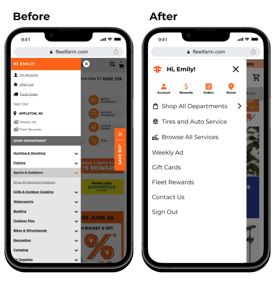
The goal was to update the main navigation of the Fleet Farm mobile website.
Website navigation is what visitors use to find pages and features; often in the form of links, menus, and buttons.
Changes Made:
Updated page header, making it easier to read and tap.
Increased the size of buttons and icons for accessibility.
Made the slide-out menu wider and moved existing features into it for overall clarity
-
70% of page traffic was on the mobile web, so a mobile-first approach needed to be implemented
the UI had been last updated in 2016, prior to the Digital Experience Designer position existing
The page header was too narrow with
-
My Role:
Proposed idea to E-Commerce IT Manager
Developed the wireframes and mockups for the experience
Conducted critique sessions to improve design
Aided in Quality Assurance Testing
Who else contributed:
E-Commerce IT Manager
Global developer team
Quality Assurance Testers
IT Analysts
Timeline:
The project was pitched, developed, and implemented in 5 months, in addition to regular web and app releases.
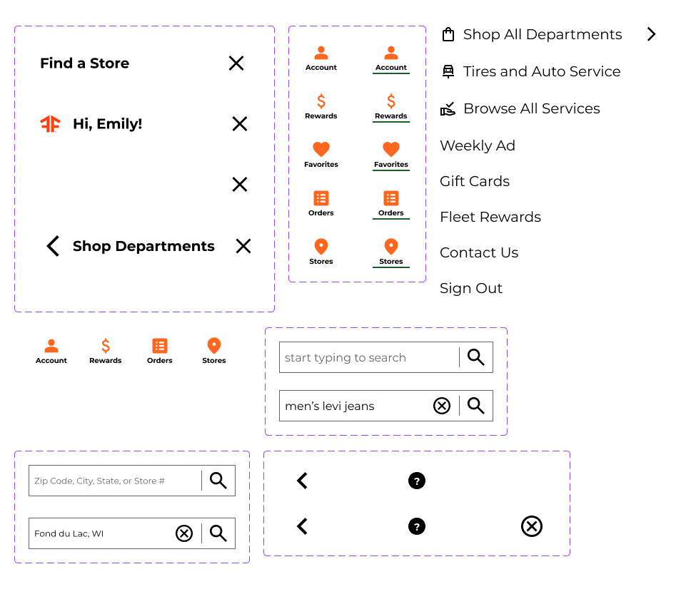
Slide-out Menu:
Find a Store:
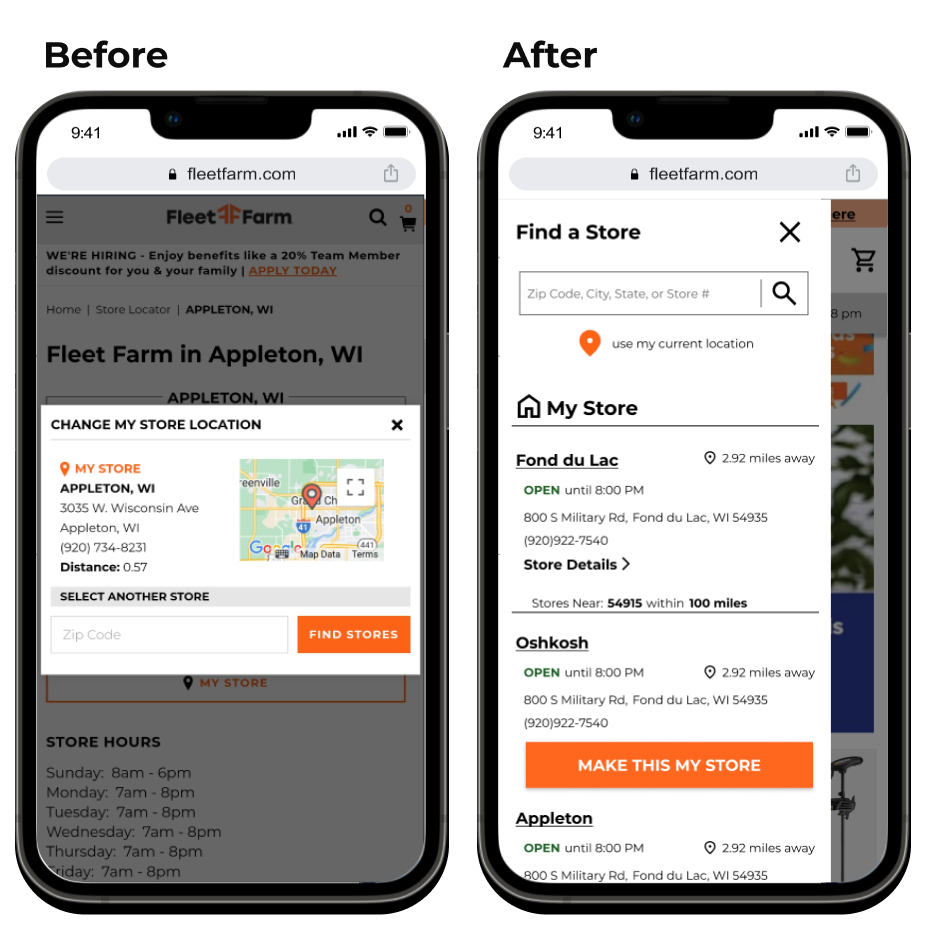
Updates:
The pop-up was moved into the slide-out menu for consistency in experience.
The new menu automatically displays nearby stores and makes switching the user’s store location easier.
The search bar was made to be more prominent.
‘Make this My Store’ button text size was increased for accessibility.
Shop Department:
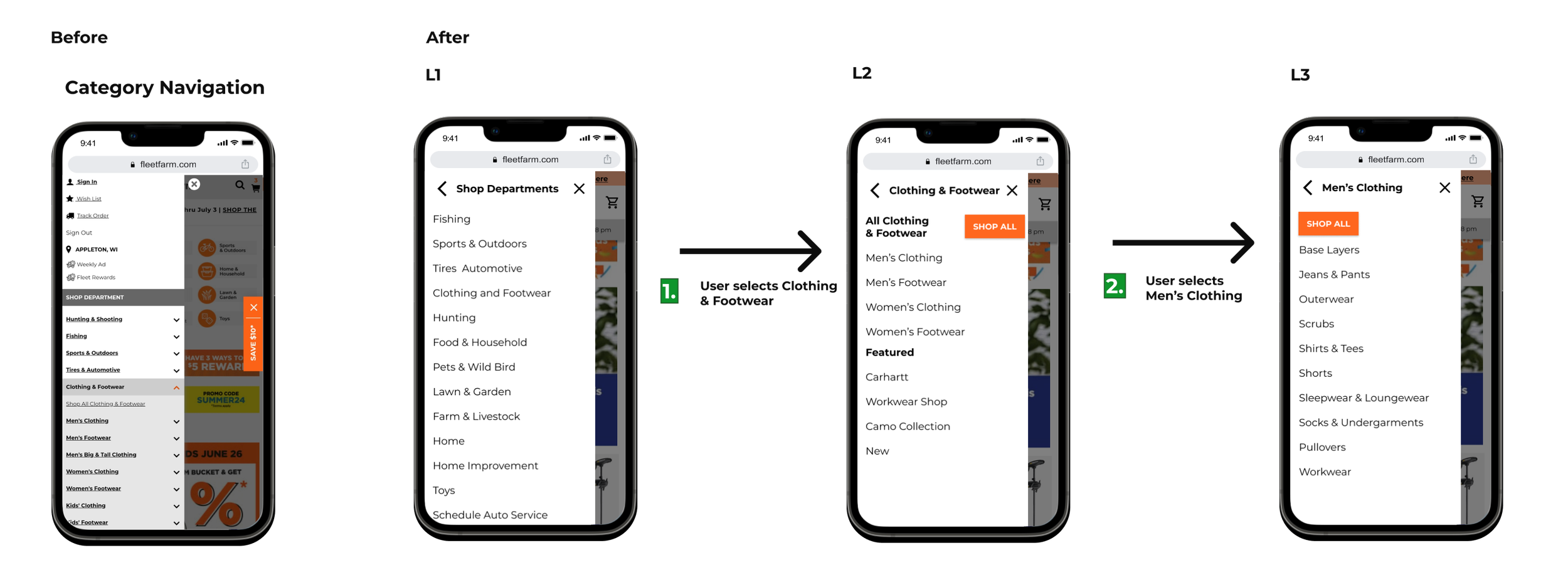
Updates:
Increased size of category links to adhere to web content accessibility guidelines.
Selected facet displays at the top of the slide-out.
The new experience opens each category in a slide-out page, making it easier to understand than the previous expanding and collapsing containers.
Page Header:
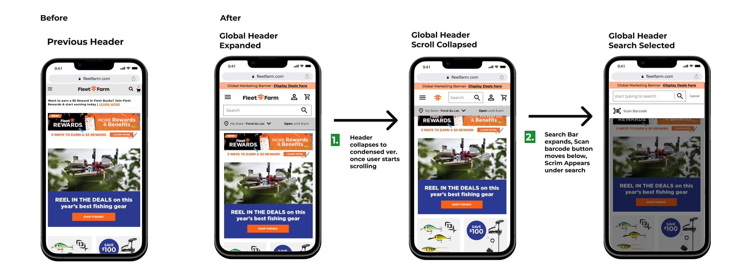
Updates:
The page header was widened for ease of tapping
The elements in the header were re-sized for accessibility. Previously the buttons were very small and hard to tap.
The search bar was expanded to make it easier to use and find
Profile icon was added to reduce clicks
A new line shows the selected store and its hours.
Fleet Rewards Relaunch
-
Bring new elements to the Fleet Rewards Program and update the UI accordingly.
Including:
New 3 tier program
Fleet Rewards Members earn 1 point per $1
Fleet Rewards+ Members earn 2 points per $1
Fleet Rewards Credit Card members earn 5 points per $1 spent
Making new point and tier trackers
Updated graphics and styling
-
Revitalize the Fleet Rewards Loyalty program to increase sign ups.
Rewards UI was stagnant for many years and needed to match the new branding
-
My Role:
Developed the wireframes and mockups for the app, desktop, and mobile website
Conducted critique sessions to improve design
Aided in defining requirements
Aided in Quality Assurance Testing
Worked with project stakeholders to establish requirements
Team:
Loyalty program administrator
Marketing Team
Development Team
Quality Assurance
Legal
Store Operations
Timeline:
New Program launched February 2024
Project was developed over the course of a year
program needed to be updated and edited
the mockups took around 2 months with 2 months of development and testing time

App Experience
Fleet Rewards Tiers

Updates:
When the user is logged in and navigates to the Rewards tab, it shows their tier and reward info
The point tracker was updated to be a circle display
Another tracker was added to show the user’s progress towards the next tier
The trackers’ color coordinates to the tier the user is currently in
Fleet Rewards Benefits
Updates:
When the user is NOT logged in and navigates to the Rewards tab, they will see this page listing the program's benefits.
New icons for the benefits
Table listing the rewards and benefits of all FR tiers, Fleet Rewards, Fleet Rewards+, and Fleet Rewards Credit Card

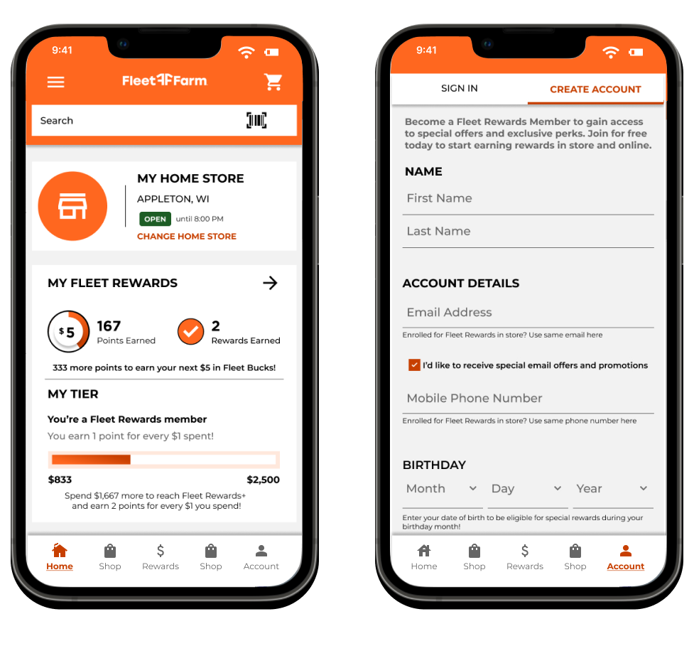
Homepage and Account Creation
Updates:
‘My Home Store’ added to the Home Page to show users which store they are currently shopping
My Fleet Rewards component was added to the Home Page to make points, tiers, and rewards clear to the user.
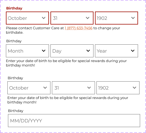
‘Birthday’ field was added to the create account form for the additional information collection
Web Experience
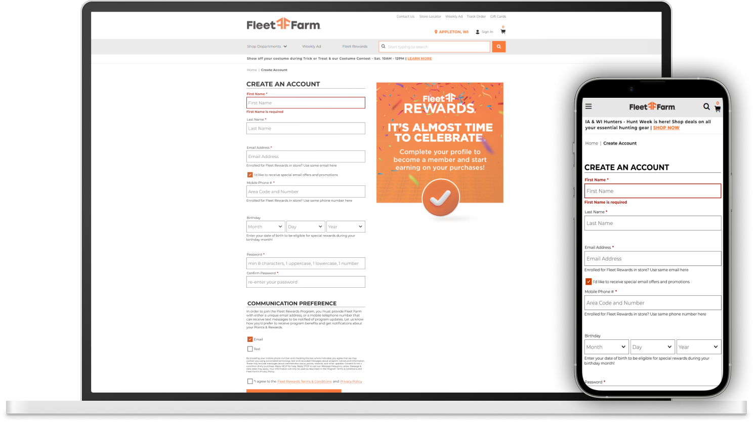
Create an Account
Updates:
The Create Account page was given updated graphics.
An extraneous login page was eliminated to reduce user clicks.
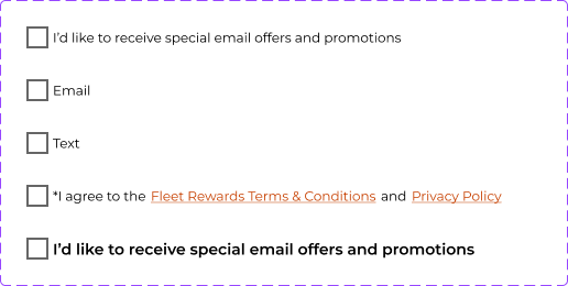
A birthday field was added to the ‘Create an Account’ form to collect user data upon signup
Birthday was updated so that it couldn’t be changed once the user had entered it. Previously, the birthday was a single text entry field that could be updated at any time, allowing users to possibly collect more than one birthday reward

My Account Page
Updates:
Fleet Rewards section was moved to the top and given updated styling
Circle tracker added to show the user’s point progress to a reward
Line tracker was turned into the tier tracker. This shows how many dollars have been spent in a year and progress towards a higher rewards tier
Trackers change color depending on the user’s tier


Design System
-
At its core, a design system is a set of building blocks and standards that serves as a blueprint in creating digital products.
The design system I created was mainly contained in a Figma document.
It contained text styles, colors, and reusable components.
-
The design system was created to maintain speed and consistency in mock-up creation.
Once a new component was made, it could be saved in the design system to be reused.
For example: there are text box components in the design system. Any time I need to add a text box to a mock-up, I can open the design system and easily insert the brand-approved text box.
If I make a 'Sign Up' form, it will be a group of text box components. The GROUP can then be saved to be reused. Meaning any time I want to add a 'sign up' form, I have a consistent form with brand-approved text boxes.
-
The design system is a living document that was created throughout my role at Fleet Farm. Since the Digital Experience Designer role didn't previously exist, a library of web assests needed to be established.
Team: Me
got existing brand colors and logo guidelines from graphic design team so I could match things to their requirements
This page is about the elements contained in the design system
Visit the Process Development page to learn more about how the design system was used and implemented.
Gathered all existing button styles
Made different states such as ‘static’, ‘selected’, and disabled
allows it to be used and referenced elsewhere, updating the master component will update all instances
Later proposed updates to make the buttons align with Web Content Accessibility Guidelines.
Buttons
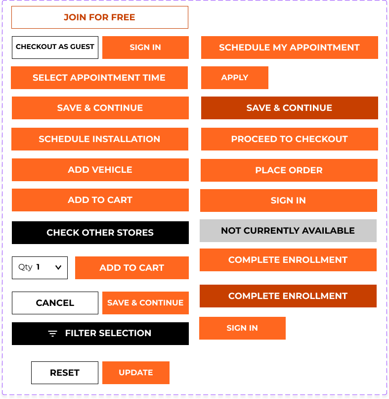
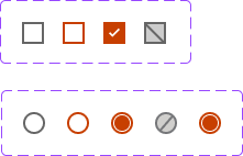
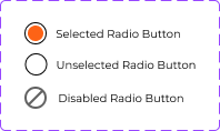
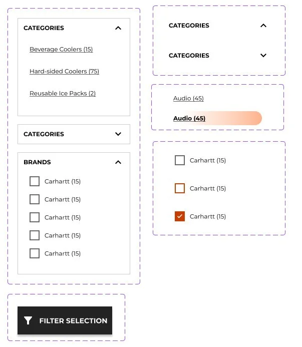
The radio buttons and checkboxes were updated to a darker orange color for accessibility
Made different states such as ‘static’, ‘selected’, and disabled
Created basic and complex components
The radio box is a separate component with various states. It can be paired with text, links, etc., to form a new component that follows the rules and styles of its elements.
Radio Buttons and Checkboxes
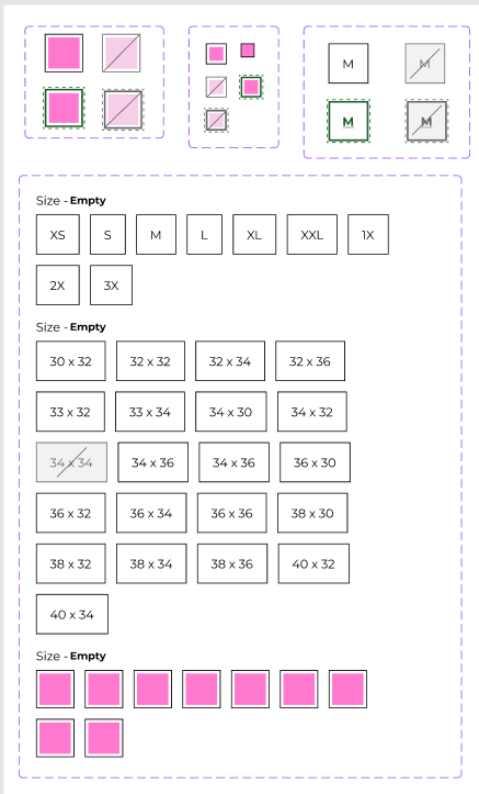
Product Detail Page Components
Updated the selectors for facets such as color and size
Made different states such as ‘static’, ‘selected’, and disabled
Created basic and complex components
Gathered many components such as item image, price display, favorite icon, and facet selectors.

Mobile Navigation Components
These are some of the assets for the Global Mobile Navigation project.
Components are developed in their related project files, and once the project is complete, the components are added to the Design System to be reused as needed

Facet Menu Components
These are some of the assets created to update the category facet menu
Links were updated across the site to be more accessible, removing the orange color and making the links black instead.
The category menu links looked strange after the accessibility change, so these are the redesigned links and containers